Fashion Futures 2017
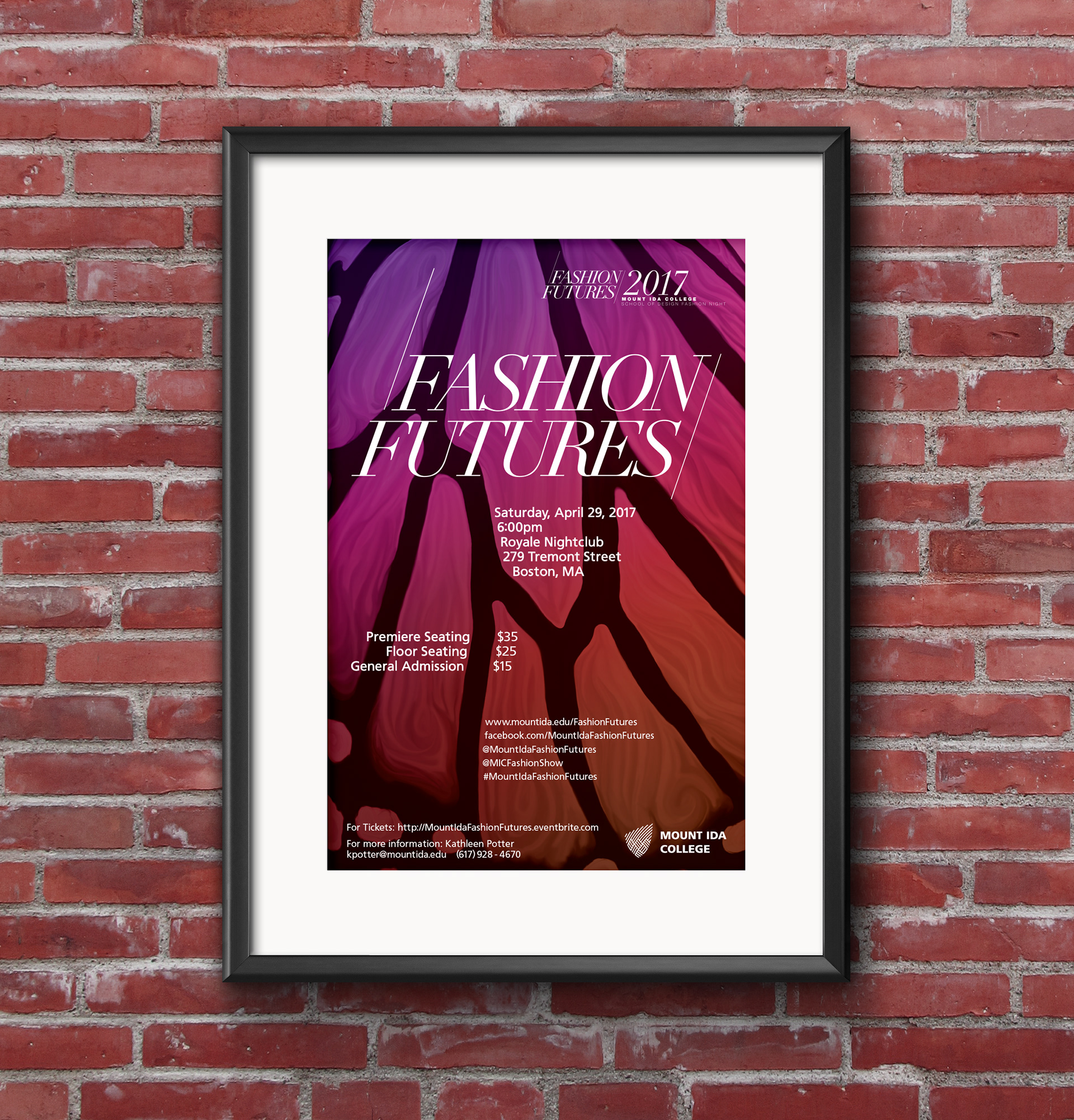
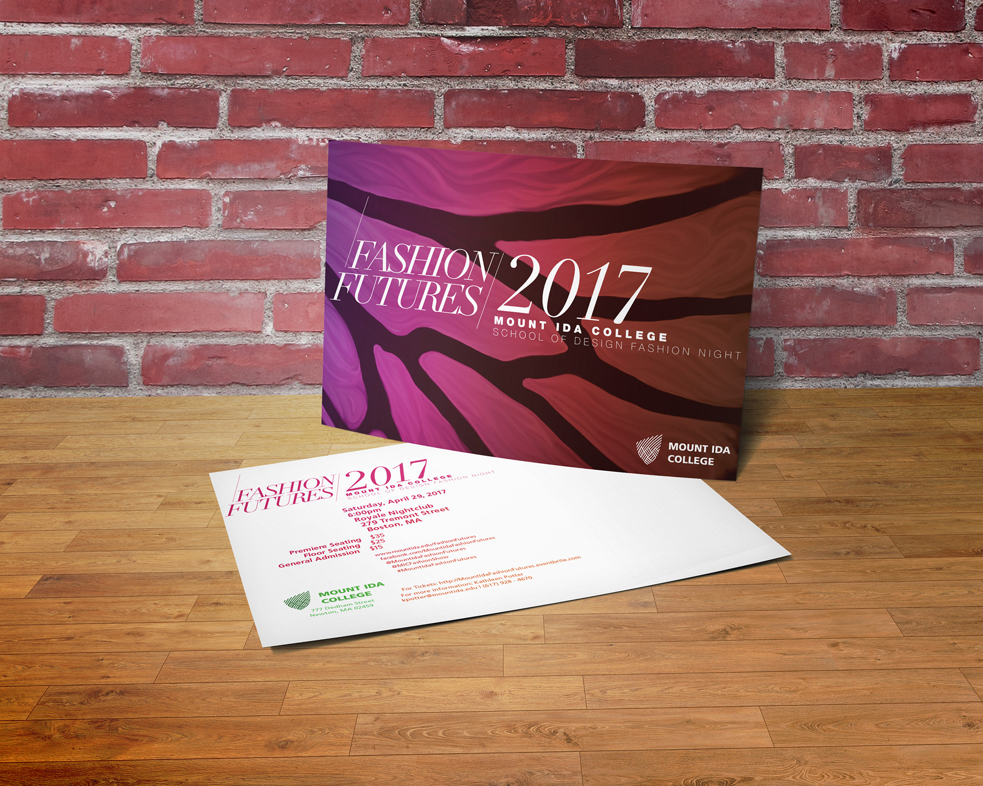
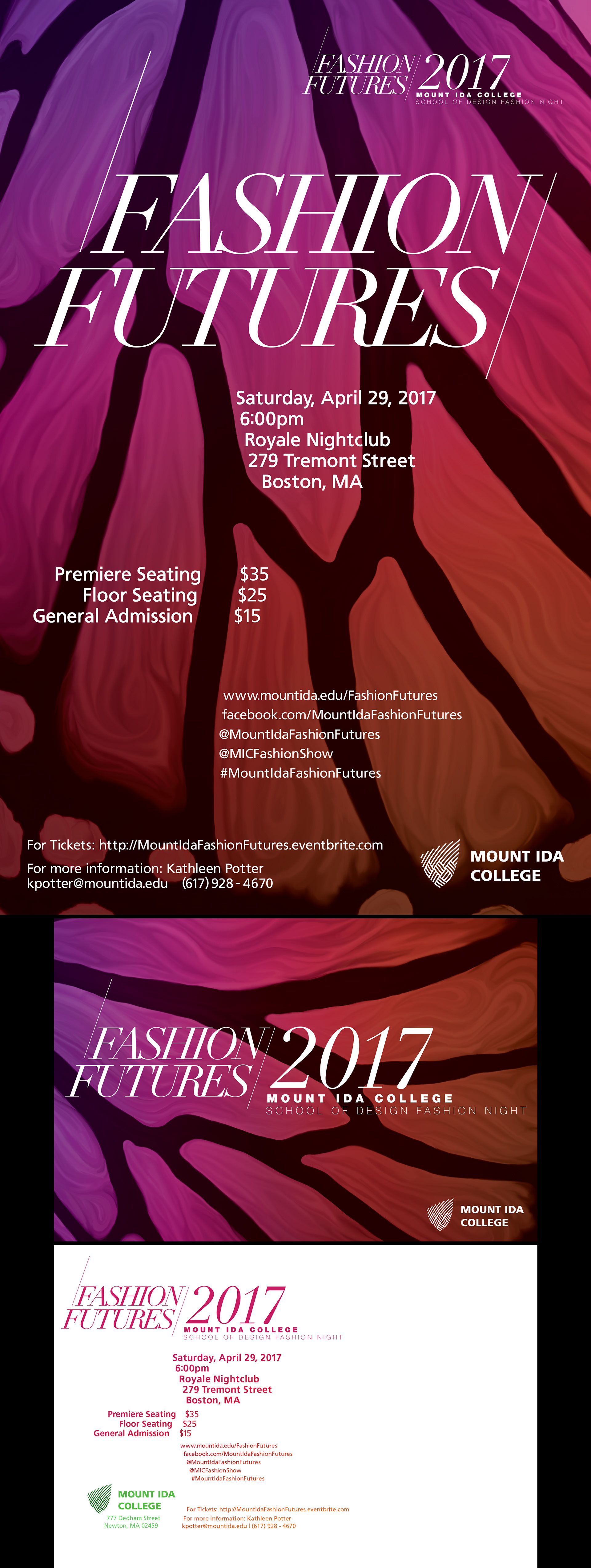
The goal of the Fashion Futures 2017 assignment was to create a creative and professional design for the event’s marketing materials. This event, used to showcase the work of the Fashion Design department’s students, is currently an event attracted by family and friends of the students whose work is on display. It can be described as ‘improving,’ but many think of it as restricted due to the size of the college. Our goal was to help change this perception to one that is professional, sophisticated, engaging, and most importantly noticed by industry. There is still the necessity to target a primary audience of family and friends, but the end result should also be notable to an aspirational audience of industry figures. By targeting these audiences together, the final design should be professional, modern, and eye-catching. My concept for Fashion Futures 2017 uses a combination of geometric typography and organic imagery as a unit. The wing of a butterfly is used as a natural form for the background. Instead of straight photography, photographic manipulation is used to create a smoother, subtler, and more abstract form. The wing, based on the look of a monarch butterfly, fits well with the text because it contains some more linear forms that work well with the logo’s text. The body text uses a slanted vertical edge with the logo and the background in mind. The color palette is initially derived from the School of Design color palette determined by their branding standards, then deviates in the background for a dynamic palate.